
Enable
Therapy Centre
Logo Design, Brand Language Development, Brand Illustration
The Brand
Enable Therapy Centre is a community of therapists and special educators helmed by Neha Shah, an expert in the field of remedial and special education. They work with children and adults situated across the spectrum of mental health and learning abilities, to support them as they fulfill their potential and live their lives to the fullest.
The Brief
Enable came to us for a logo, brand language and illustrations that reflected their values in a manner that made their clients feel welcome and at home in their space.
The Thinking
The Thinking
Enable’s role is one of a friendly collaborator. They listen to, understand and accept their client’s needs, and leverage these learnings to offer them the best support and expertise. They see themselves as constant learners, growing with their clients as they work together for the same purpose. The Enable Brand Language is rooted in this core belief.
The brand’s essence was encapsulated in these keywords:
Warmth, Friendliness, Collaboration

The Visual Metaphor
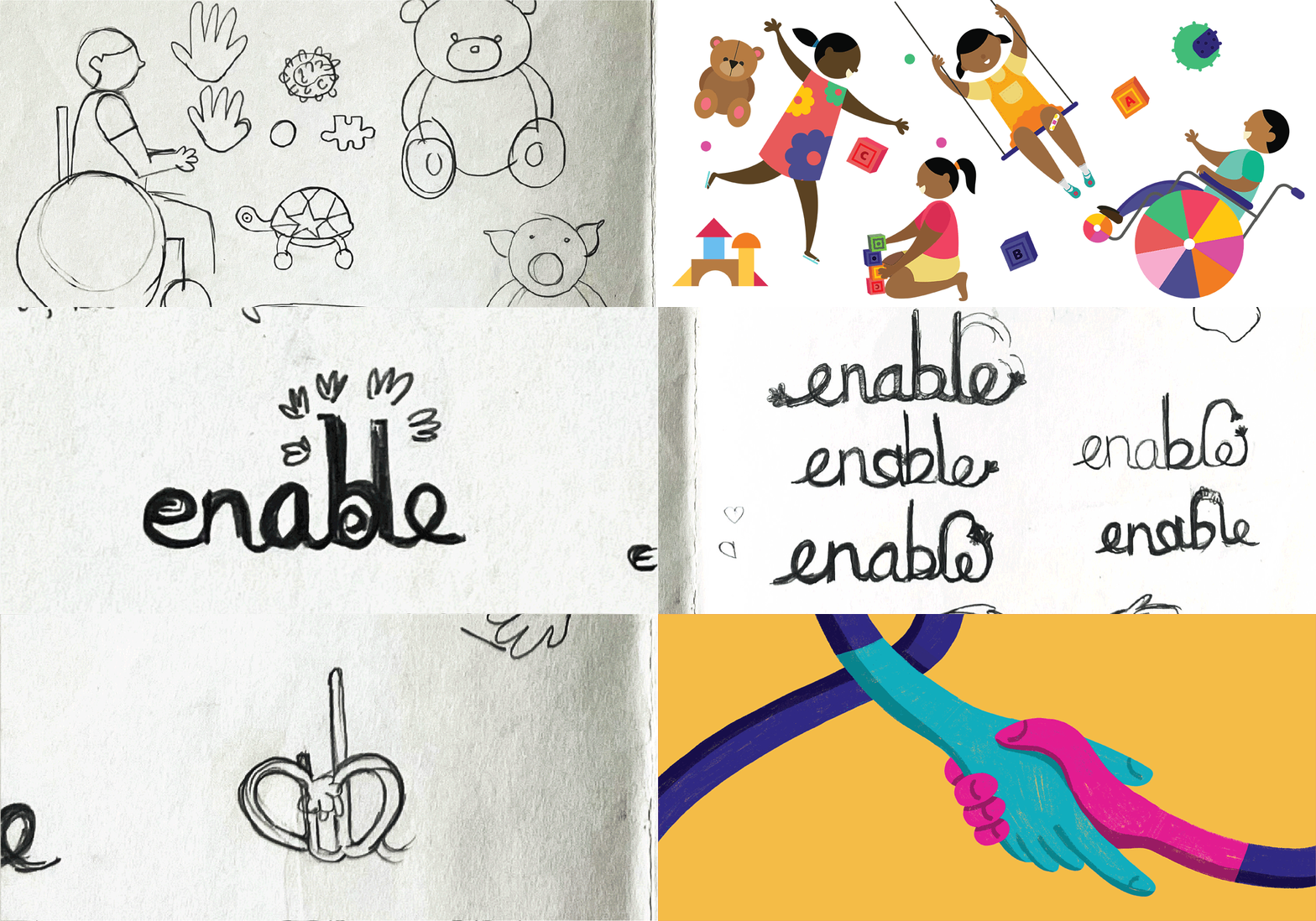
After exploring a number of approaches, including the children themselves, we arrived at a pair of hands as the perfect visual shorthand for Enable. As a universal symbol of a friendliness and collaboration, it captured perfectly the spirit of the Enable Therapy Centre, that puts clients and their needs at the center of everything they do.
The Logo
In keeping with the brand’s essence, the Enable logo is a cheerful wordmark that exudes a sense of play and warmth. Each of the logo's four colours represents a key areas of intervention - mental health, education, assessment and community building.


Assessments
Community
Mental Health
Education
The Brand Colour Palette
Carrying the 4 logo colours forward, we developed a colour system of tints and shades of each colour which were were then used across Enable's communication to help clients differentiate between the various services offered.
The Brand Illustration Style
A warm, hand-drawn illustration style adds a sense of warmth and tactility to all the brand’s communication.
A series of illustrations was developed for the Enable website, to be used at the head of each of its pages

Header illustration for the "Our Team" page

Header illustration for the "Therapy" page

Header illustration for the "Sound Therapy" page

Header illustration for the "Contact" page

Header illustration for the "Life Coaching" page
The Brand Language
The Enable hands, colour palette and illustration style were applied to the Enable communication plays out primarily on digital platforms.
Templates were created for the flyers and posts, with the colour changing as per the specific service. A strict layout was developed, with clear type hierarchies established, a consistent position for the logo and registration details. They were inflused with a sense of play and warmth with the use of soft flowing lines, and the enable hands in the corners.


The Enable hands, colour palette and illustration style come together to create a brand language that emphasises warmth, care and a strong sense that
‘we’re in this together’

